
Before we jump in, a quick little note: this isn’t a Blogmas post (I know, I know 😅). I’ve been pretty sick and needed a couple days to rest and reset. But don’t worry — Blogmas is absolutely coming back. I just had to take a tiny pause so my body could catch up. Thanks for being patient with me. 💛✨


Every year, I wait in eager anticipation for Pantone to unveil its Color of the Year. It’s always exciting to think about how this color will influence fashion, design, and even our everyday lives. I love imagining how trends will evolve and how designers will incorporate this hue into their collections. But this year? I’m a little… meh.
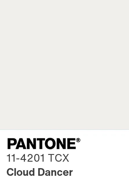
Pantone’s 2025 Color of the Year is Cloud Dancer (PANTONE 11-4201)—a soft, creamy white.
And I’m sorry, but… huh?? That’s it? That’s the color? That’s the moment?
Listen, I get the appeal. White is clean. Fresh. “Timeless.” It’s the color equivalent of a crisp button-down shirt. But after all that buildup—imagining designers dramatically rolling out fabrics in some bold, personality-filled shade—Cloud Dancer feels like the equivalent of showing up to prom in… socks. Like, yes, technically you’re dressed, but are you giving a moment?
Cue my best Miranda Priestly: “Groundbreaking.”
The Dream of Color of the Year
The Pantone Color of the Year isn’t just a swatch on a palette. It’s a statement, a reflection of the collective mood, and a snapshot of where the world is heading. Over the years, we’ve seen bold choices like Ultra Violet, Living Coral, and even the very vibrant, high-energy Illuminating Yellow. These colors felt alive, offering possibilities and excitement for designers and consumers alike.
And then Cloud Dancer walks in like:
“Hi 🙂 I’m… white.”
It’s giving landlord special.
It’s giving “freshly painted apartment you’re not allowed to decorate.”
It’s giving “dentist office but make it fashion.”
And I don’t know about you, but I’m not sure how deeply a muted white is going to rock the fashion or design world.
The Reality of Trends
I like to keep my finger on the pulse of design and fashion trends. Over the past year, I’ve seen a lot of rich, moody tones making their way into homes and wardrobes—dark greys, deep blacks, earthy browns. These colors speak to the current mood: cozy, introspective, and a little edgy. They feel grounded and real, mirroring a post-pandemic desire for comfort, self-expression, and a deeper connection to one’s surroundings.
White just doesn’t fit with that narrative. In the world of interior design, especially in the U.S., white walls and minimalism have been done to death. We’re gravitating toward darker, more atmospheric environments—think charcoal walls, navy velvet sofas, and even black-painted furniture.
We want depth. We want texture. We want rooms that feel like warm hugs, not Apple Store showrooms
Am I Just in My Own Bubble?
I’ll admit it: I live in a world where everyone loves a dramatic wall moment. Charcoal, navy, espresso—give me a rich, broody shade and I will swoon.
So maybe Cloud Dancer really is the breath of fresh air some people crave.
Maybe Pantone is trying to hit reset.
Maybe this is a subtle cultural shift toward simplicity and softness.
Maybe this is the visual version of a deep exhale.
I can see that. I just… don’t feel it.
Final Thoughts: Cloud Dancer, I Just Don’t Feel You
I think my disappointment comes from the hope that Pantone would offer something unexpected, something that would spark a new conversation in the design world. Something that would feel relevant to the times we’re living in.
Instead, we got white.
Pretty white, yes.
But still—white.
Maybe Cloud Dancer will grow on me. Maybe one day I’ll see it in the wild styled in some magical, Pinterest-core way and have an awakening. But for now?
I’ll be over here, daydreaming in charcoal and merlot and midnight blue…
waiting for a Color of the Year that feels as dramatic as my inner world.

